Roles of the President — November 6, 2016

Roles of the President

rolesofpres-fw

This image will be used multiple times throughout the 8th grade Presidential unit.  Students will first use this image when they are introduced to the roles of the President.  They will then develop definitions for these roles that better help to break down the roles the president fulfills.  In addition, students will use this image as a checklist when creating a daily agenda for the President.

For this image I focused on symmetry and using the white space on either side of the writing to help focus the students.  I also wanted to emphasize the text in the middle as important and necessary to the learners.  By using symmetry and space I was able to chunk the important information and show separation between the title and the content.

Originally I had the roles separated into different text boxes, which was overwhelming to the viewer.  Next I used bullets to separate the roles.  I finally went with the check boxes, to follow past formats I have used, as well as, make his image more usable for the students.

Organization — October 30, 2016

Organization

president-unit-overview3-fw

Students in 8th grade American History will be using this image as an overview for the unit of study.  This will be used throughout the unit and eventually become linked to the corresponding units.  Students should be able to understand the titles on this graphic and their associating materials.  

I chose to represent this overview as if it were a road.  Earlier suggestions on my graphics mentioned to include the road so I thought I would give it a shot.  I went back and forth on this multiple times, but eventually came up with this graphic.  To help with the understanding of my graphic I used many of the organizational techniques to show hierarchy.  I used numbers to show the progression of the lessons.  I also used a flowchart model to show that the title is the overarching idea, while the “exits” below fit into this hierarchy.  I also used arrows to show the “Strong” connections from the unit to the smaller lessons (Lohr, 146).  I was torn about some of my colors in this image.  Traditionally my images have had the red, white and blue theme.  However to fully show the road and exit signs I changed those colors to match what we naturally assume they are.  I chose to keep the traditional blue up top show it would stand out.  This contrast can help convey that this information is the most important to read for this graphic (Lohr, 133)

I remade this image several times.  The title I kept, for the most part, the same from the start.  The main changes happened with the lesson titles.  I originally had them matching my past color schemes.  I even eliminated the road at one point because I felt it didn’t match.  But after consulting with my fiance I decided to add the road back in and make it even more authentic with the exit signs for each lesson.

Lohr, L. (2008). Creating graphics for learning and performance: Lessons in visual literacy. Upper Saddle River, NJ: Pearson.

Color Image- Notable Presidents — October 23, 2016

Color Image- Notable Presidents

Students in 8th grade American History will be using this image as a focus for understanding political parties.  At this point in the unit students will have learned about democrat and republican parties, as well as other parties that have been a part of elections in the past.  All students will be familiar with the names and terms used in this graphic.  In addition, students have used “timeline” like graphics in the past so they should be able to follow the graphic.

I chose to use a blue background with white lettering for the title to help it stand out.  According to Lohr, using color for labeling information will help students to differentiate between the information they should view first and last.  I also learned that using color for learner organization can be helpful.  I chose to label the democrats and republicans with their associated colors (blue and red).  I hoped that this would help students both with associating the presidents in the picture, as well as, associating these colors in general with their corresponding political parties.  

I originally had borders around each of the presidents.  After consulting with my fiance, he noted that it was too busy and hel felt the information was already organized enough.  He said the borders were too distracting.  In addition, he helpd me work on alignment and making sure the images all flowed.

Lohr, L. (2008). Creating graphics for learning and performance: Lessons in visual literacy. Upper Saddle River, NJ: Pearson.

Selection Principle – Presidential Requirements — October 16, 2016

Selection Principle – Presidential Requirements

president-requirements-fw

My 8th grade students will be using this image when beginning the unit on becoming president.  They should understand who the president is in relation to the U.S. government.  In addition, they should be familiar with vocabulary such as “natural born citizen” and “residency.”

When considering how to complete this image I originally thought of a table.  However, after reading the chapter on selection, I came across Figure 5-3 on page 104.  This image showed how the table lines can sometimes skew the focus of the learner.  This helped me to design this image, by making sure to emphasize the main points of the graphic, without distraction, like a table.  I also tried to focus on the 3 c’s for this section.  I used a blue background for the title to draw attention and concentrate the image focus.  I also kept the information concise to help maintain the learners focus and emphasize the key points without distraction.  I was torn about using an image or not.  I find the seal of the president to be an important piece of the presidency so I wanted to incorporate it into the image.  I wanted to make sure it did not distract however, like in the clock image in the text book.

I asked my fiance to review the image.  He liked the simplicity of it and told me to make a few changes with centering of the title and the image overall.  He also noted to fade the seal so it was less distracting, which I think was a big change.

Lohr, L. (2008). Creating graphics for learning and performance: Lessons in visual literacy. Upper Saddle River, NJ: Pearson.

CARP – Swing States — October 9, 2016

CARP – Swing States

swingstatemap1-fw


The users of this image will be 8th grade American history students studying the 2016 campaign.  This unit will likely be the first time they will learn about swing states and their influence in the election.  This image will allow them to learn which states are the most important to watch for on election day.  Students should know the state abbreviations and be able to decipher which states are the swing states.  In addition, the students should know to use a key when referring to a map.  

To help focus students and create an image that is not too distracting, I used the same font and similar font colors throughout this image.  This use of repetition should help the students understand the purpose of the text and not become confused (Lohr, 203).  

I also considered the proximity of the text in my image. Within the map, I have little control of where I can place my text.  However, the title and the key were tricky when considering placement on the image.  I chose to make place both of them at the top of the image to show their important in understanding the image.  But I placed them further apart to show that while they both guide the image, they are not the same thing (Lohr, 203)

Yikes, my first attempts at this image were awful.  My viewer was overwhelmed and had no idea what to look at.  I struggled with making the title fit the image without overwhelming it, but after considering proximity I felt comfortable with making the size it currently is.  In addition, I made adjustments to how I was highlighting the swing states themselves, which now I believe is more consistent throughout the image.

Lohr, L. (2008). Creating graphics for learning and performance: Lessons in visual literacy. Upper Saddle River, NJ: Pearson.

Design Process – Road to the Presidency — October 2, 2016

Design Process – Road to the Presidency

becoming-pres-fw


This visual will act as the unit guide for 8th grade students learning about the Road to the Presidency.  The visual does not include descriptions of the path to the presidency, rather just the bigger ideas fitting into each section.  This will help students understand exactly what we will be studying.  Students will likely have littler prior knowledge on the presidential election process, so this will act as their first introduction to the process.  

I conducted a lot of research on the presidential election process to come up with these 7 steps, which I think will be the most beneficial when teaching my students.  During the analyze phase of ACE, I considered how this visual will benefit my students.  I found that it would be organizational, as it will present the information to them in hopefully a logical flow.  I chose to go from top to bottom to organize the concept, as I felt students would likely start reading the graphic from the top and work their way down the visual.  This was something I considered during the create phase of the ACE process.  Lastly, the evaluation of my graphic is probably most important.  I followed the evaluation process as laid out Lohr to look at effectiveness, efficiency, and appeal.  I do believe that the visual does help instructionally and that the amount of content is not overwhelming.  I hope that the students will be able to associate the information with the unit itself and can easily interpret the information.  I do think that the visual is clear and will make the learners feel like they can easily understand the concepts.  However, I do wonder if I could add more visuals to motivate the students to view the image.  I just am torn between simplicity to make sure students get what they need to out of the content and with being creative and making something visually exciting.

When sharing my image, user review is that it does accomplish the task of introducing the process to students.  They felt that the design fit in with the rest of my images and will be a good reference for students.  I did ask about whether I should “spice up” the image at all by adding an additional image and my reviewer noted that it might attract students more.  So I am a bit torn about whether to add some flare or not?  

Lohr, L. (2008). Creating graphics for learning and performance: Lessons in visual literacy. Upper Saddle River, NJ: Pearson.

Shape Tools – Liberal vs. Conservative — September 25, 2016

Shape Tools – Liberal vs. Conservative

This image is designed to help 8th grade students understand the basic differences between liberals and conservatives when relating to our government.  This graphic will be used early on in the unit of study for the election process because it helps provide students with the basic information they need to understand political parties and the election process.  When considering the complexity of these concepts, I decided to keep my graphic simple.  To try and avoid overwhelming or distracting the students from the basic information.  I used common shapes of the arrows to show the defined lines in the two sides, as well as show connections between the top words and the bottom indicators (Lohr, 250).  I hoped that the simple visual of the arrows will help them to understand how the sides vary and stray away from each other over many topics.  My goal was to show “direction” as it relates to the political spectrum, hence the arrows (Lohr, 254).  

Originally, I used arrows as bullet points for each of the indicators, but found that it was too much distraction on the page.  I also considered showing where different modern political parties fell on this spectrum, but again the graphic became to overwhelming.  I decided the ultimate learning goal of this graphic was to have students learn the basic differences, so there was no need for “extra”.  I will make an additional graphic showing where political parties fall on the spectrum.

Lohr, L. (2008). Creating graphics for learning and performance: Lessons in visual literacy. Upper Saddle River, NJ: Pearson.

EdTech 506:Typography — September 18, 2016

EdTech 506:Typography

My unit of instruction is geared towards 8th grade students learning about the presidential election.  I chose my four words based off of key words students will come across in this unit.  They are: Ballot, Campaign, Elect, and Swing State.  

ballot-fw

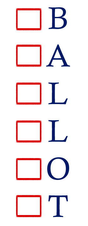
Ballot – To represent ballot I chose to include the check boxes found on most common ballots.  I used the check boxes next to the letters in the word.  I chose to use all capital letters to keep the letters the same size and position throughout.  I made two attempts at this word, first I put the letters in the check boxes.  As I reflected on that image, I felt the word looked more like block letters you might see a child playing with and did not portray a ballot.  I also chose to use the colors of red and blue to emphasize the American presidential election theme.

campaign-fw

Campaign – When nominees campaign they often speak in front of large crowds and attend political rallies, often use a megaphone to speak.  I chose the same red and blue as in ballot to continue the American presidential election theme.  Although the book mentions that often capital letters can be more difficult to read, I chose capital letters for campaign for 2 reasons.  First, in order to best fit the megaphone in as the “p” it needed to be capital.  In addition, I believe the capitals emphasize the idea of campaigning “loud and proud.”  Originally I had added “2016” below the word campaign, but after looking at the image and the purpose of the unit, I realized that I did not want to select just this years campaign, as I will hopefully use this lesson in the future.  

swing-state-words-fw

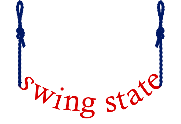
Swing State – Swing state was a fun word to create.  I knew that using some type of a swing would be important.  I had considered using an image of an actual swing.  I also considered just having the words in the swing shape, without the rope.  After reviewing the image with a coworker, they felt the ropes were necessary in creating the “swing” affect.  We also decided that continuing the use of the red and blue would be important.

elect2-fw

Elect – I found elect to be the most difficult word I chose.  I created 4 different options for the word before settling on this one.  I originally had planned to use a check box and an “x mark” as the “t” in elect.  However, after showing coworkers and students I realized that it was difficult to identify the word.  Next, I began adding the check mark to the E.  I went through many color options before choosing to blend the same red and blue into the E.  

EdTech 506: Universal Design — September 4, 2016

EdTech 506: Universal Design

Universal Design and Visual Literacy

As I read through the chapters on universal design and visual literacy, I couldn’t stop thinking about where I see images that follow these principals.  Usability and accessibility to all is an important principal to follow.  Lohr explains that the “goals of universal design focus on making information and learning accessible in the broader sphere of life for all people (Lohr, 2008, p8).” So as a designer, it is important to think of who your audience is and what their various background might be.  

Crosswalk - imageswalk-dont

I chose a safety image because I feel like these images must be universal to all languages and educational backgrounds.  I chose to provide both of these walk, do not walk signs as examples.  The image on the left utilizes images and no words to express when it is time to cross the street.  These images are efficient and simple in design.  Lohr discusses how efficiency vs. appeal apply to universal design.  If instructional goals (like crossing a street) are the goal of the image than it is important to maintain simplicity and efficiency (Lohr, 2008, p51.  The design on the left shows symbols that should be universal to all backgrounds, in addition they are very simple, allowing the user quick response time (which is a necessity when crossing the street).

What also struck me during my reading, was the question “are pictures worth a thousand words?”.  While the image on the left contains no writing, I believe it does help the user understand the goal (Lohr, 2008, p51).  The image on the right, which is also often used at cross walks, uses the English language instead.  While this sign is simple in design, it is not universal to all languages or educational backgrounds.  In many cases, words help make an image more understandable, however, images such as the hand or the man walking apply to more users.  
Lohr, L. (2008). Creating graphics for learning and performance: Lessons in visual literacy. Upper Saddle River, NJ: Pearson.

Burgstahler, S., Dr. (2015). Universal Design of Instruction (UDI): Definition, Principles, Guidelines, and Examples. Retrieved from http://www.washington.edu/doit/universal-design-instruction-udi-definition-principles-guidelines-and-examples

EdTech 506: Personal Introduction Image — August 28, 2016

EdTech 506: Personal Introduction Image

Personal Introduction EdTech 506

I enjoyed making my first image for Ed Tech 506.  It really got me excited about what I will learn from this class.  I love making graphics but as you can see, I definitely have a lot of learning to do!  I used Adobe Fireworks to create my image and spent a lot of time figuring out how the program worked and how to manipulate things in the way I wanted.  I feel pretty comfortable using this program going forward, although I’m sure there is a lot more about it!

I chose to use a corkboard as my background because I feel like I am always using them to hold to do lists and stick things that make me happy, to remind me that life isn’t that crazy!  School starts for me tomorrow so things are about to get crazy again, but I am excited to get back in a more solid routine.  On top of teaching I coach both softball and cross country after school and into the evenings.  I played college softball at St. John Fisher and it was a huge part of my life.  I loved my college and our athletic department so I am always hanging up Fisher Athletic posters in my classroom and my new house.  This past May I got an awesome black lab puppy and along with her came my engagement ring, so that is why there is a wedding planning to do list on this board as well!  My puppy’s name is Nike and she is so much fun!  I will probably plaster my classroom with pictures of her this fall!